

Glidepath
Bringing the power of AI to franchisees
Overview
We partnered with Glidepath as their embedded design team — shaping the brand, product, and marketing site for the AI platform that helps franchisees and brands find the right fit and grow with confidence. One retainer carried the work from the first sketches of the logomark to the Webflow launch.
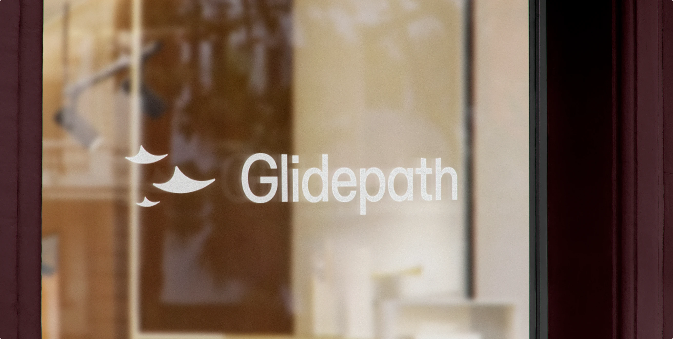


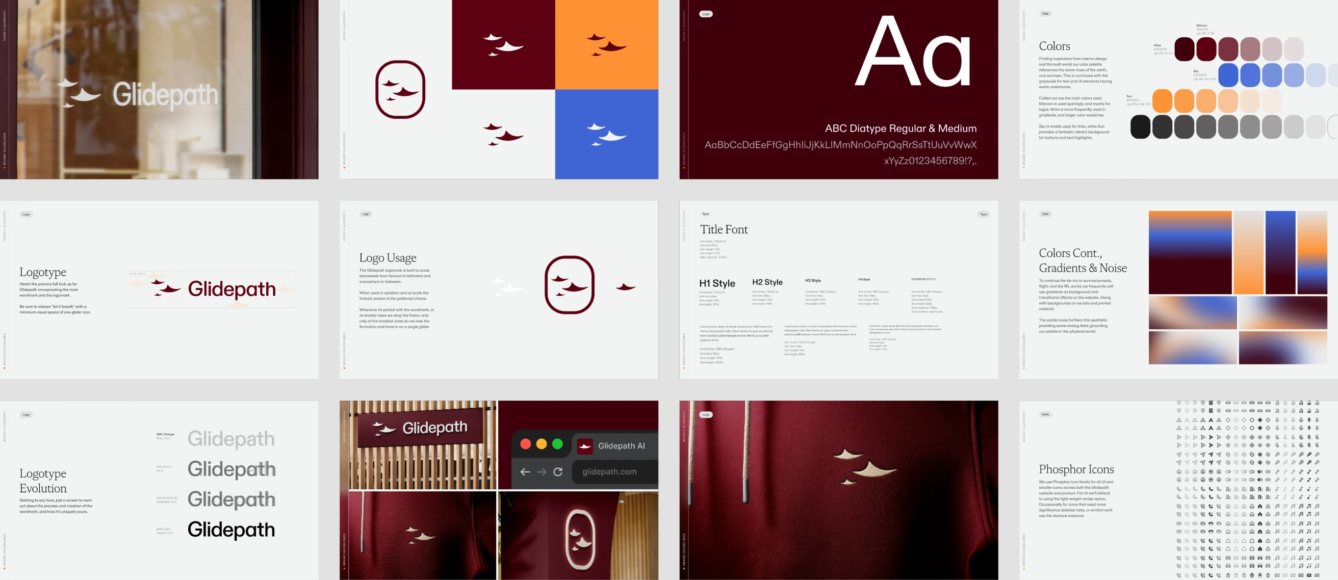
Designed to glide
The 3 gliders in formation evoke imagery of planes, or birds but are intentionally abstract to avoid feeling too direct. With their direction always facing right and subtly downward, to harken back to the concept of a glidepath.
When framed the heavily rounded rectangle is symbolic of looking out through a plane window.
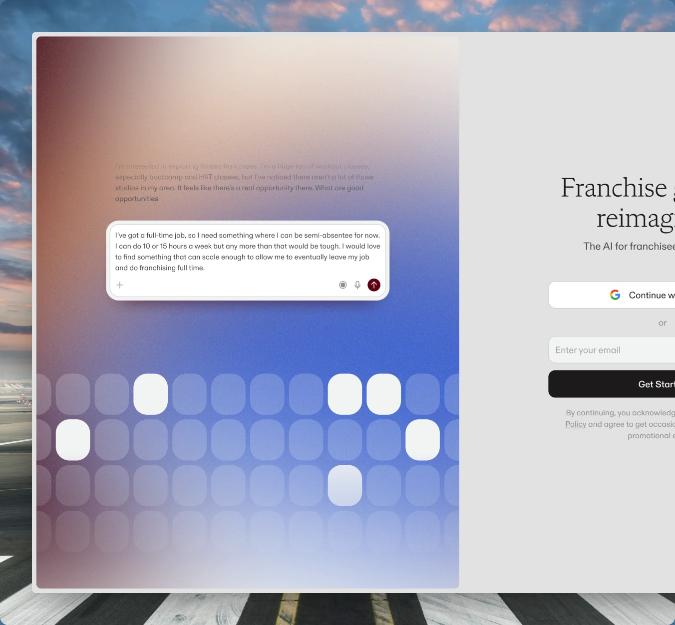
The franchise copilot
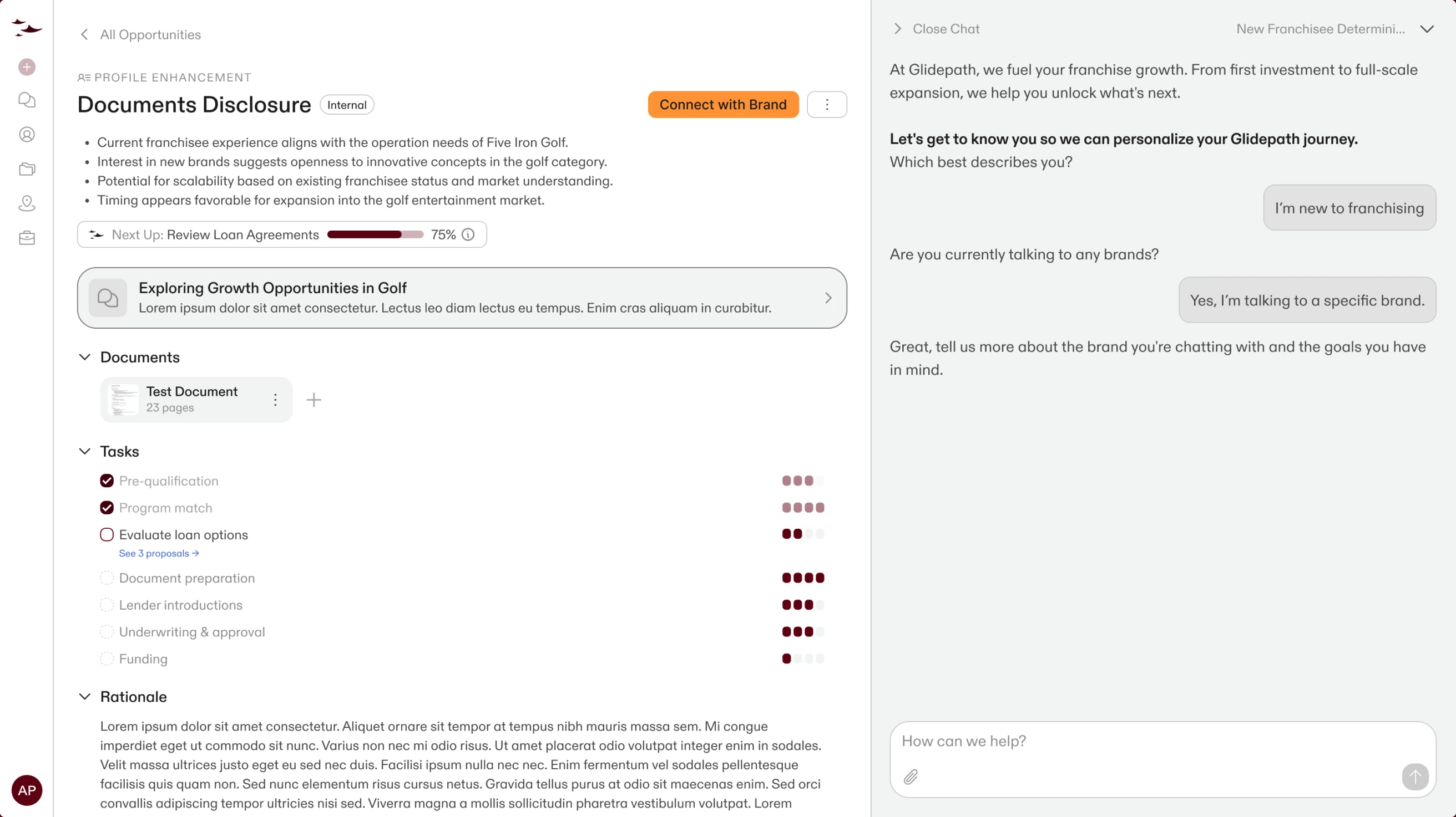
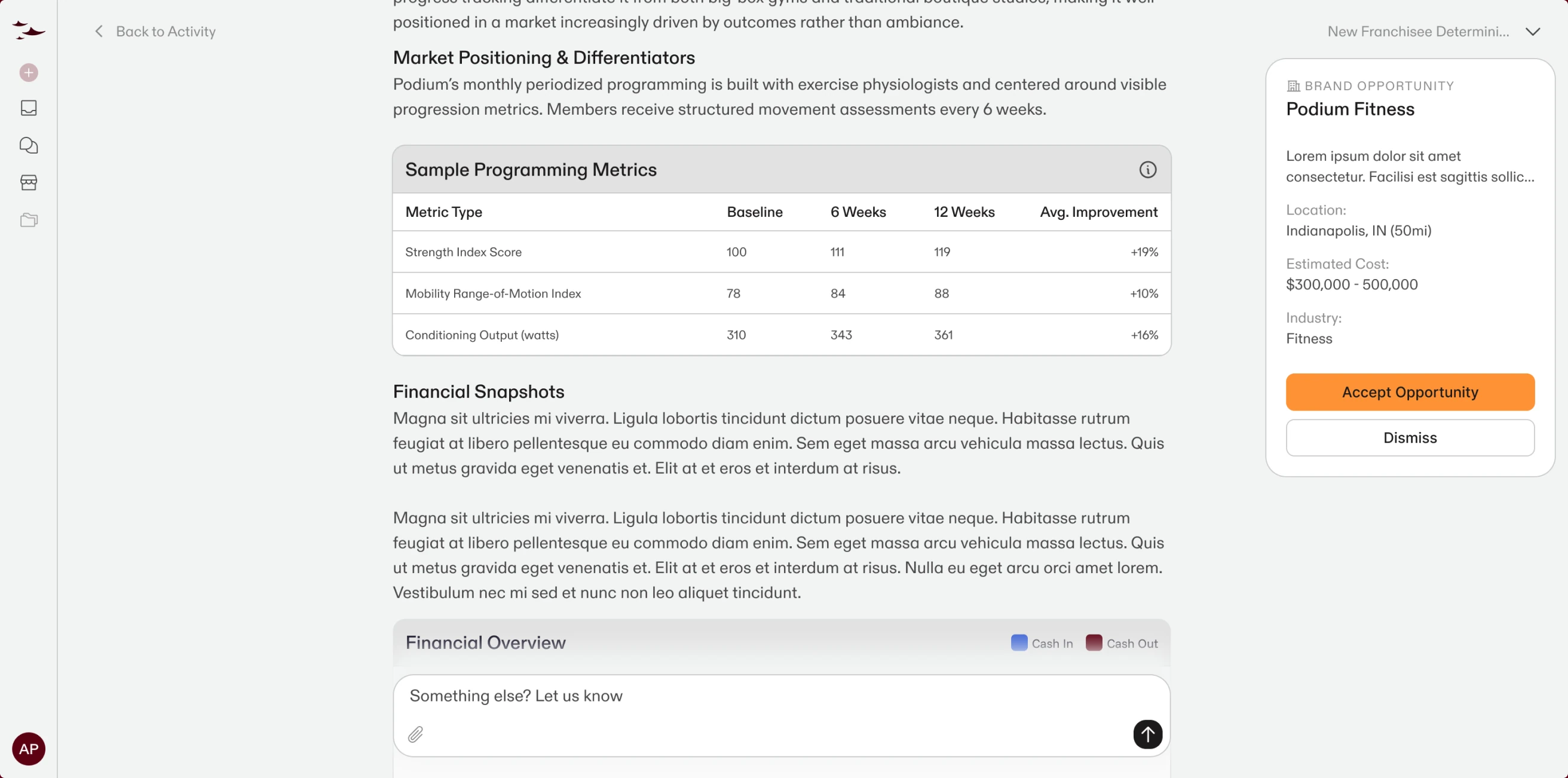
Glidepath’s product is a conversation. We redesigned onboarding from voice-first to chat, shaped the opportunity and portfolio views, and defined interface patterns for an assistant that guides users from first question to signed agreement — personalized, knowledgeable, and always on.
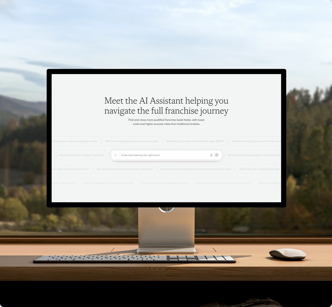
Design in the Agentic Era
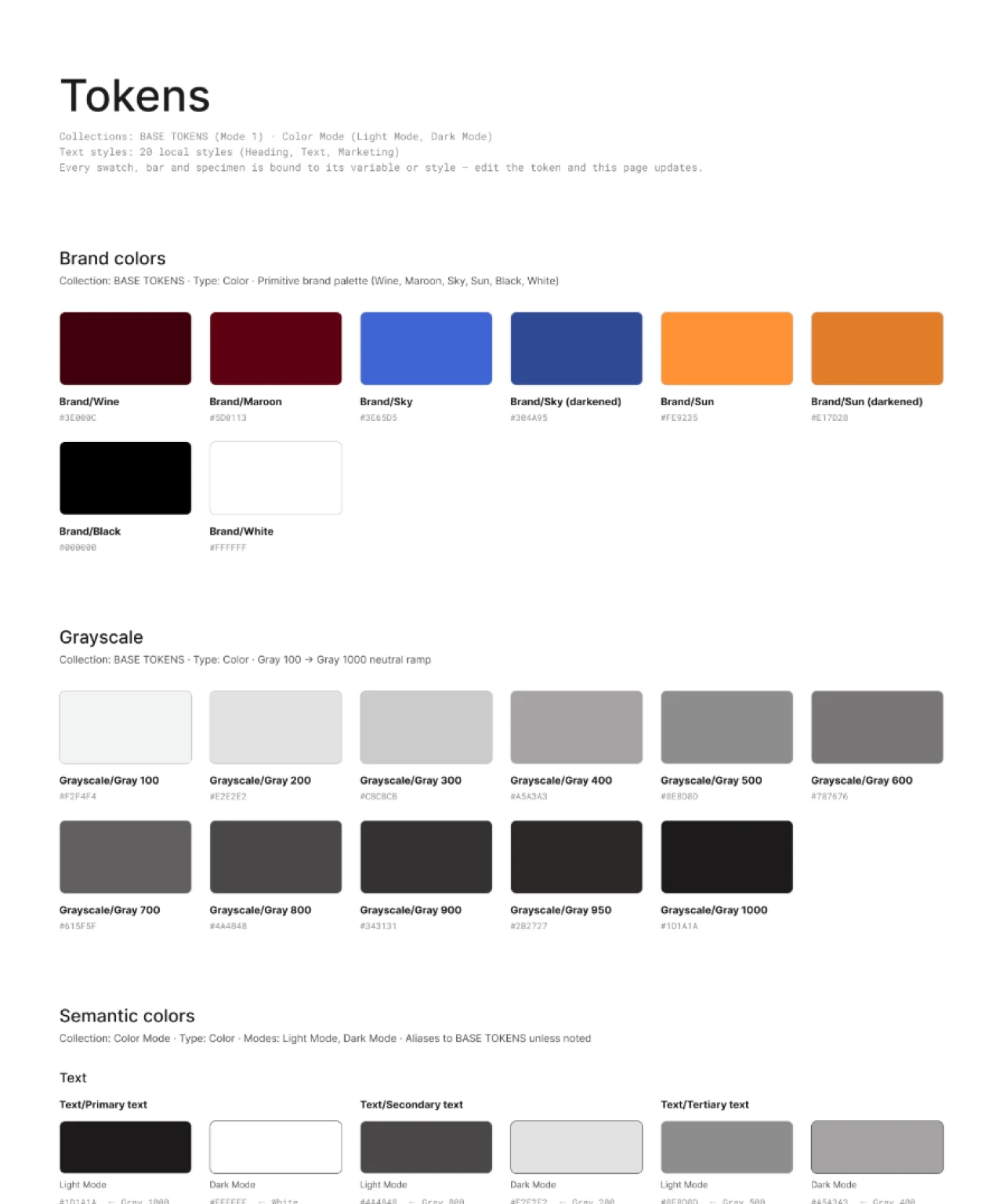
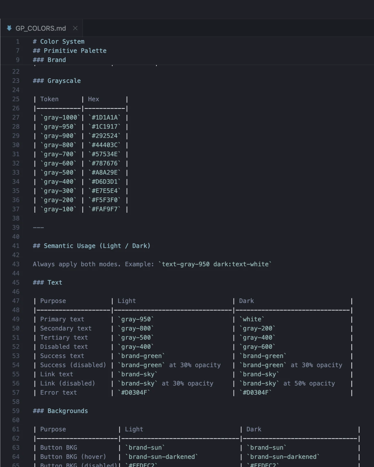
We worked with the developers at Glidepath to create a design system that wasn’t just a static Figma file, but that could be deployed and utilized by agents, and developers building new features, some before they were ever even built out in Figma. This enabled Glidepath to go from concept to production faster than ever before, while not sacrificing their brand visuals.

Services
- AI Consulting
- Brand Strategy
- UX & UI Design
Delivered
- Branding
- Design System
- Marketing Website
Partnership
- Sapling + Brand
Industries
- AI Native
- B2B SaaS
Links
# Glidepath

We partnered with Glidepath as their embedded design team — shaping the brand, product, and marketing site for the AI platform that helps franchisees and brands find the right fit and grow with confidence. One retainer carried the work from the first sketches of the logomark to the Webflow launch.

[Visit Website](https://www.glidepath.com/)

## Designed to glide

The 3 gliders in formation evoke imagery of planes, or birds but are intentionally abstract to avoid feeling too direct. With their direction always facing right and subtly downward, to harken back to the concept of a glidepath.

When framed the heavily rounded rectangle is symbolic of looking out through a plane window.

[The Glidepath logomark and wordmark as a white decal on a storefront window](02-gallery-decal.webp)

## The franchise copilot

Glidepath’s product is a conversation. We redesigned onboarding from voice-first to chat, shaped the opportunity and portfolio views, and defined interface patterns for an assistant that guides users from first question to signed agreement — personalized, knowledgeable, and always on.

## Design in the Agentic Era

We worked with the developers at Glidepath to create a design system that wasn’t just a static Figma file, but that could be deployed and utilized by agents, and developers building new features, some before they were ever even built out in Figma. This enabled Glidepath to go from concept to production faster than ever before, while not sacrificing their brand visuals.

- AI Consulting
- Brand Strategy
- UX & UI Design
](/api/content/images//work-media/glidepath/02-gallery-decal.webp)